Creating An Advertisement For My Fiverr Gig
Creating a graphic advertisement involves graphic composition, image editing and copywriting. I’ll show how I go about creating an effective advertisement for my content writing services.
Tips On Creating A Graphic Advertisement
To be in the running for a sale, you must make your value proposition clear, be positive, be memorable, and don’t be negative. Your reader will take in the page as a whole, with your text, images and colors all creating an impression together.
Strategies To Keep In Mind
Elements Checklist and Positive Goals
- Create Interest and Excitement, starting with the headline
- Create a memorable impression
- State your proposition to the reader
- Show how you can benefit the reader
- Create a consistent, positive overall impression
- Show the reader what to do next
Negative Pitfalls To Avoid
- Don’t take up more of the reader’s time than necessary
- Don’t confuse the reader verbally
- Don’t confuse the reader visually
- Don’t distract the reader from buying
- Don’t say or show anything negative unless your service fixes it
Creating A Graphic Advertisement Step By Step
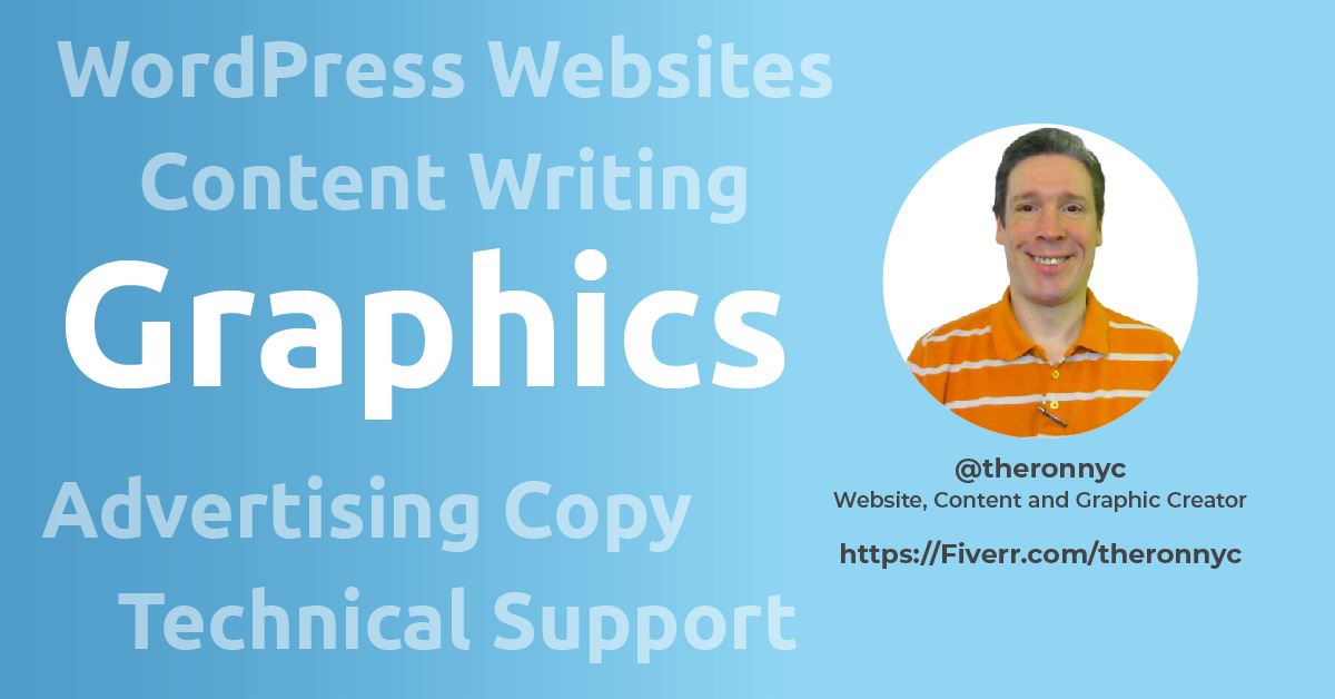
The graphic advertisement created in this example will be used on my Fiverr account. Creating a detailed description of my task is my first step. My task description reminds me how much space I’ve got while I work, and not to forget any elements.
Graphic Advertisement Description
- Summary: A single graphic image advertising Content Writing Services.
- Pages: 1
- Dimensions: 1280 x 769 px
- File Format: .jpg
- Elements:
- White or colored background
- One image (Author’s Fiverr Profile)
- A headline
- A second headline
- One or two paragraphs of advertising copy text, possibly using bullets
Writing My Advertisement
I’ll just start at the top and proceed down the advertisement.
Headline 1
Below is the first headline. Using only a few words, we want to say that I’m a writer. We’ll make this statement appealing by stating that my client’s readers will like the content, and that search engines will find it.
Engaging, SEO-Friendly Writing
Headline 2
For my second headline, I state that my native language is American English. Fiverr is an international marketplace of skills, so we’ll state the language I write in.
By an American English Speaker
Advertisement Text
For my advertisement text I’ll accentuate that my writing is customized to my client’s audience, and written per their specifications.
I’ll write content tailored to your audience, according to your tone and SEO specifications.
The second paragraph lists the types of applications I write for. The reader will hopefully see his project’s needs among my services.
- Blog Posts
- Well-Researched Articles
- Website Content
- Product Descriptions
- About Page
Let’s see how my ad looks so far!
Engaging, SEO-Friendly Writing
By an American English Speaker
I’ll write content tailored to your audience, according to your tone and SEO specifications.
- Blog Posts
- Well-Researched Articles
- Website Content
- Product Descriptions
- About Page
That’s it for the writing! Now to create my graphic.
Creating My Advertising Graphic
I used Adobe Illustrator but you may prefer Canva or another program. Creating the below graphic didn’t require any advanced features. I’ll discuss the design in the sections below.

Creating A Page Layout
My page layout is Left-Aligned, which I’ve come to like better than centered headings. Here’s how I laid out the text on the page:
- Made the vertical space between elements about even on the page
- Left-aligned the elements, except the graphic at right
- Indented the second paragraph to create variety and hierarchy
- Centered a line with my Fiverr URL at the bottom (which fell into a hierarchy with the indented previous paragraph)
- Aligned the first paragraph of text with the top of the graphic to its right (but moved it a little lower)
- Aligned the second paragraph of text with the bottom of the graphic to its right (a little inconsistently with the first paragraph)
- Made the margin running around all sides of the page uniform
Creating Visual Hierarchy
Visual hierarchy is created by sizing, coloring, and placing items to suggest their importance to the viewer. Attracting attention to particular elements is one goal; another is to make viewing the page natural.
Our example has only one graphic element, so our visual hierarchy is mostly created with the text. We used placement, size and color.
Creating a hierarchy is further discussed in Making A Design Easy To View below.
Choosing Font Weights, Sizes and Colors
Ubuntu is one of my favorite fonts as it’s a bit futuristic. That’s why I used it. Normally, I’d coordinate all documents according to my Website styles or to a client’s branding styles. In this case, Fiverr designed the page where this advertisement will be a thumbnail. So there’s no existing style to match.
I’ve only used one font for this page. On Websites I generally make headings different from body text. My logo would be the only time I use a third font. We can make variations using font weights, so more fonts are not necessary. Too many fonts can create a sense of inconsistency or disorderliness.
Blue was my choice because it creates a sense of stability and expertise. I made the first headline heavy to set the page’s topic. The second headline is lighter and italic to create visual variety.
Dark gray is a nice subtle alternative to black, so I used it for the two text paragraphs. It’s lighter than the black in the graphic, which may be noticed.
My final line of text stating where to find my Fiverr account is in a lighter blue than the headlines. The headlines should be darker because of their place in the page hierarchy. Having the last line the same color and weight might balance out the page. However, I chose the lighter blue to add variety, and to give my Fiverr account location a more lighthearted feel.
Making A Design Easy To View
Your reader’s eyes may start in one of a few places:
- At the top left
- At the largest object
- At the most colorful object
Westerners read from left to right, and from top to bottom. As our viewers read English, our headline is at the top left. From there, the reader’s eyes naturally travel to the right, and then down, with a detour to the graphic at right.
Indenting the bulleted list indicates its place in the page hierarchy is subordinate to the previous paragraph. That the final centered line is further to the right doesn’t make its information subordinate. Yet it is comfortable for the eyes to move further to the right as they did on encountering the indented list. (Maybe the last line is subordinate information in that it’s at the end of the message.)
Being aware of where your own eyes travel when viewing a page can reveal its visual hierarchy. If your eyes dance around the page trying to understand what’s most important, the page is hard to read. Ideally, the reader should be able to scan the page once and understand its message, if not every detail.
White Space
White space refers to the space between elements. Crowded pages remove the sense of effortless reading designers strive for. It’s better to use fewer words or to reduce the font or graphic size than to have too little white space.
White space can show the relationships between elements. Placing the same amount of white space around similar or related elements can show them to be related. Placing more white space around one element can indicate it needs greater attention. Spacing elements far apart can show them to be different in nature.
Balancing Weight Among Elements
Elements on the page seem to have a mass, often called “weight”. Distributing the design’s weight is done by placing white space between items, and by sizing items. Out-of-balance pages appear lopsided.
The right-hand graphic in our advertisement balances out the two paragraphs to its left. Were I not including the graphic, I would probably put the bulleted paragraph beneath the first, as it is subordinate. Visually, I would prefer the paragraphs be about the same size, especially if they were side by side.
Adding Graphics and Color
As discussed in Choosing Font Weights, Sizes and Colors above, I chose blue to inspire confidence. The dark gray font added another color (just not a colorful one). The graphic contains green, gold and aqua. As discussed below, a little red goes a long way.
The Page Background
For the page background, I chose a very light gray to soften the page’s mood. That makes the graphic’s white background stand out, adding variety to the page.
The page contains lots of white space, and white is bright. I often make Website pages white because the sharp contrast makes skimming easy (and I like the way it looks). In this case, I wanted to avoid making the text seem too stark against pure white. We specifically want the reader to linger and think good thoughts about the page’s topic.
Graphics and Their Colors
Using symbols or icons looks nicer than bullet points, so I used check marks for the bulleted second paragraph.
Initially I made the check marks dark gray like the paragraphs. Then I made them the lighter blue of the page’s final line. That created a weak impression because the check marks are small.
So I tried red, which immediately changed the overall sense of the page for the better. In combination with the graphic, the page now has four bright colors rather than just three. The colors happen to be across from one another, lending balance. The red check marks also draw attention to elements that might be in the reader’s project.